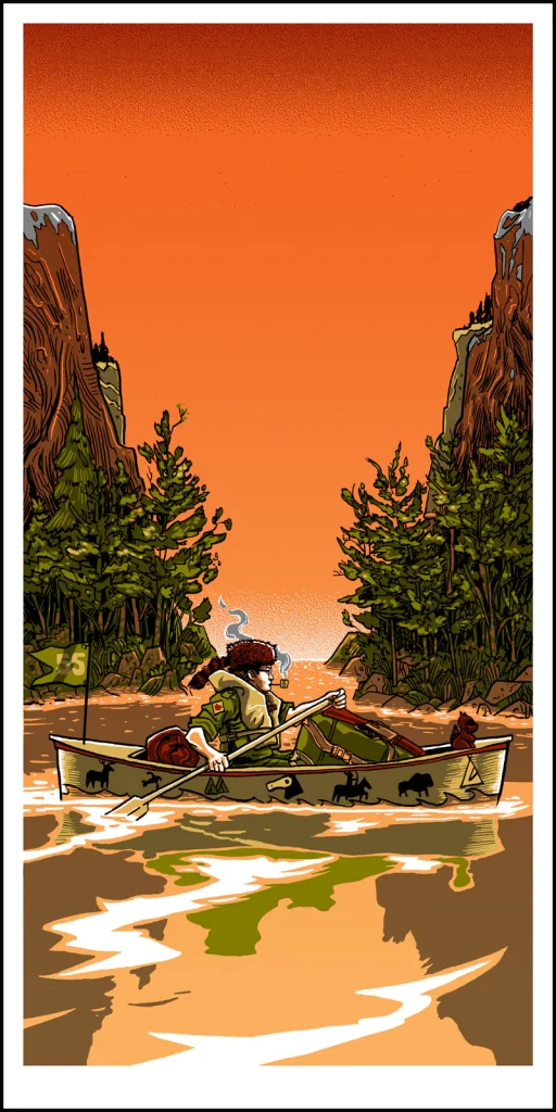
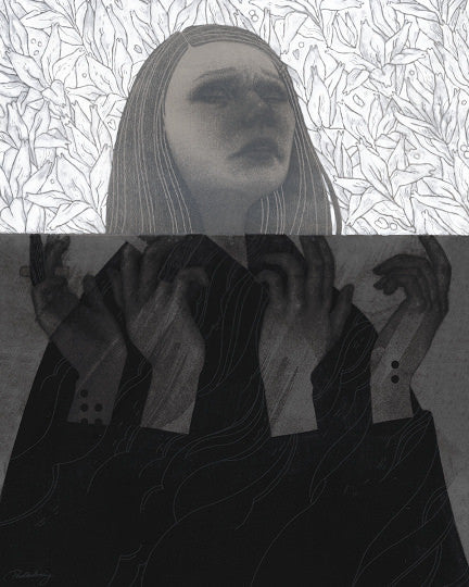
The new exhibitions opens to celebrate one of the most important film releases of the fall, ASTEROID CITY by WES ANDERSON, crowded with Hollywood stars and eagerly awaited by fans.
From Wednesday 20 SEPTEMBER 2023
“ANDERSON CITY PALETTE”
An unmissable collection, focused on the studied chromatic combinations that together with the visual symmetry and a unique storytelling style have made immortal films such as The Royal Tenenbaums or The Grand Budapest Hotel.
THE EXHIBTION
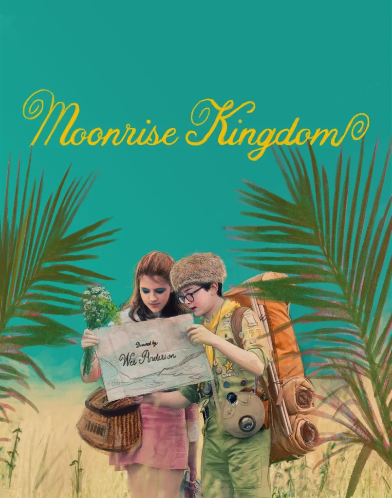
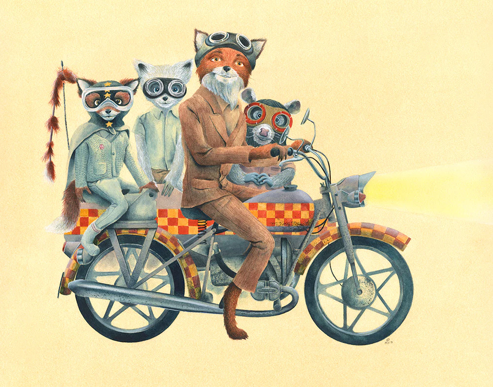
The posters on display – with a special setting that pays tribute to the famous chromatic choices made by the Texan director, which are able to exponentially amplify the emotions conveyed by the characters of his films – are inspired by films that have helped define the unmistakable style that still distinguishes the cinema of Wes Anderson.
THE ARTWORKS
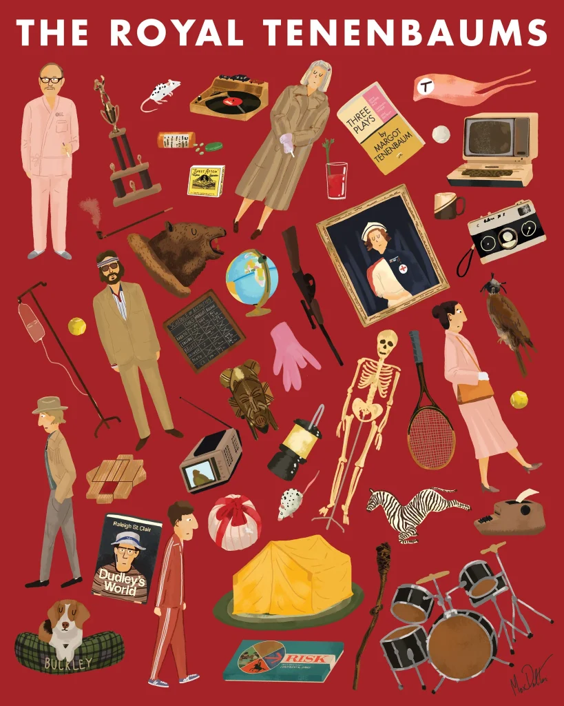
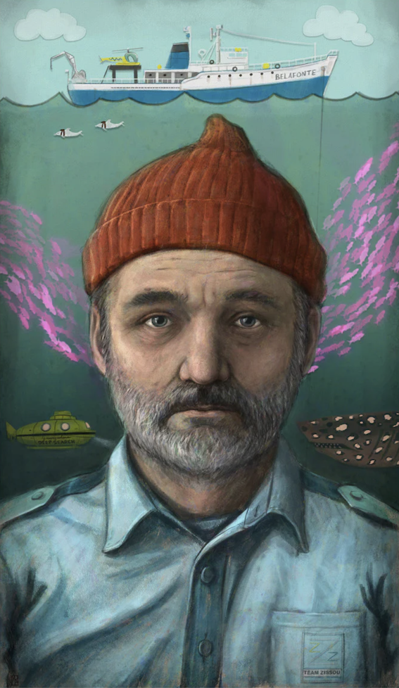
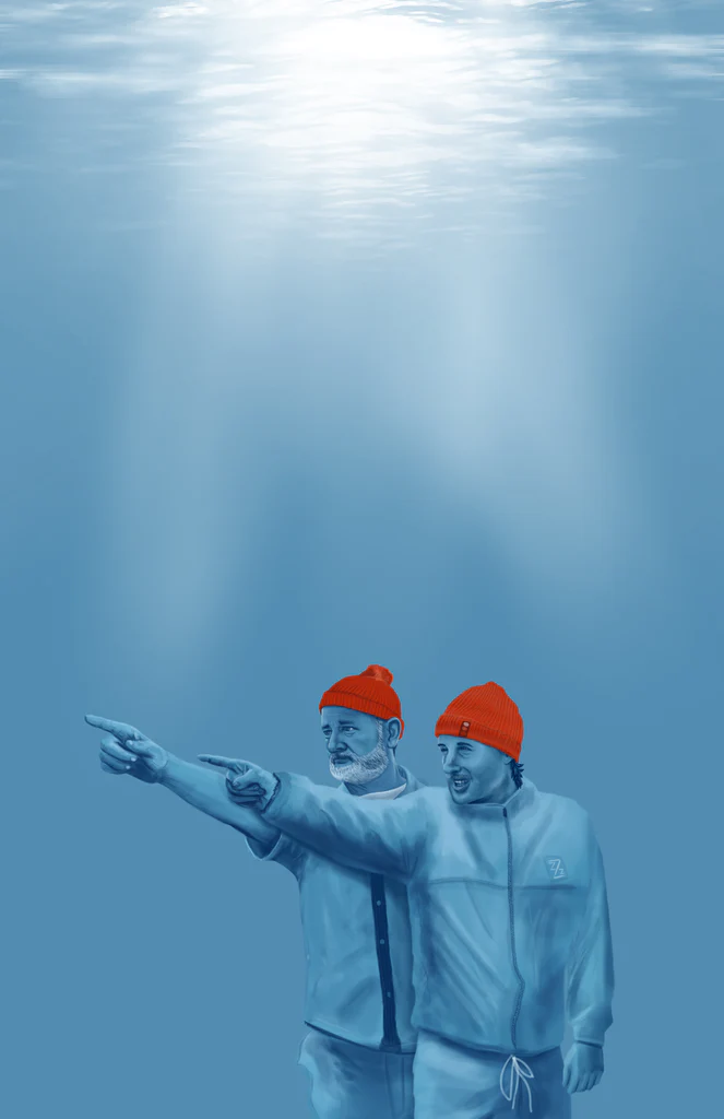
Among others, The Life Acquatic with Steve Zissou and The Royal Tenenbaums, whose posters were made by Matthew Rabalais and Max Dalton respectively. Then the animated films, such as Isle of Dogs, which Raphael Kelly was inspired by composing a poster that recalls the shapes and colors of the flag of Japan, the country where the narrative is set.
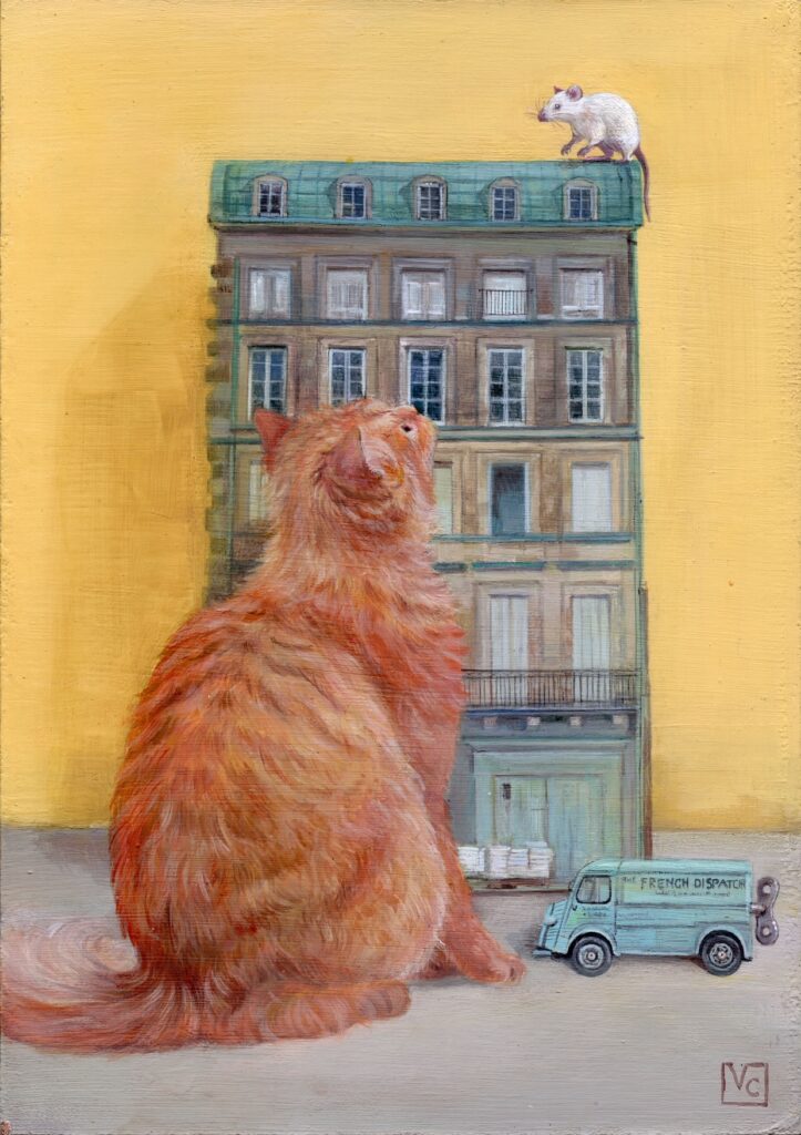
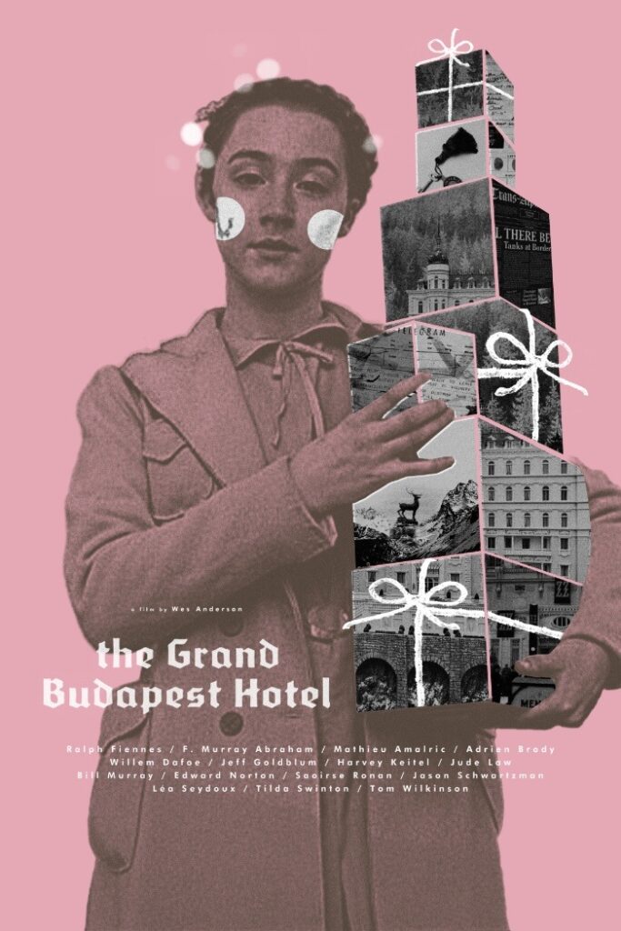
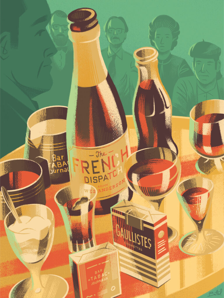
For the occasion Soggettiva Gallery has commissioned 4 works: two reworkings of The Grand Budapest Hotel by Adam Juresko and Veronica Chessa (in the form of boul de neige) who also signs an alternative version of The French Dispatch beyond the one by the the illustrator Giacomo Bettiol.
ANDERSON CITY
The infinite details and the thousand attentions in the films of Wes Anderson together with the brilliance of the colors and their calibration form a unitary and coherent system that denotes its unusual aesthetic and artistic sense. The three keys to understand Wes Anderson’s style are: an impeccable management of the color palette an innate gift for proportions and symmetries and an aesthetic with a nostalgic tone.
COLOR PALETTE
Therefore, for Wes Anderson, colors are not an additional and almost obvious component of the film, but an element that determines its frame and the final result that otherwise would not be so convincing and engaging.
If there is anything that identifies this director, it is the use of colors and the ability to match them. Those who see his films know that he prefers pastel tones. What causes through the use of colors is pure synesthesia, that reaction of our senses through which we evoke emotions without needing words.
THE CHROMATIC EMOTION
Colors and their combinations play, on an unconscious level, a fundamental role in watching a film and therefore on the involvement of the audience.
Wes Anderson uses his aesthetic technique of the use of color, framing and symmetries not only to the aesthetic end, but looking into the form of the true substance, with the aim of emphasizing the inner aspects of the characters, as a function of psychology by making sure that the characteristics of the protagonists are reflected in the aesthetic that represents them.
THE COMPOSITION
The shades of colors present in each scene harmonize as in a painting and every moment taken is combined with a color palette. What is striking about the director is the desire to transform cinema into a composition. A painting of a painter with complementary colors and at the same time nuanced. The work on colors, symmetry and framing are as protagonists as the story of the film. The chromatic choices become a way to relate the characters to the space that surrounds them and a way to emphasize the sensations and emotions of the same. (Giulia Notari)
MATTER OF DETAILS
Another feature that represents the director is geometry. It manages to create neat and perfect settings that make sense within the story. His sets are like little postcards full of details. Every table, every bookcase, every wall is a world of its own.
RETRO’ NOSTALGIA
Nostalgia for the past is the third element in Wes Anderson’s aesthetics. Everything has a retro feel, although there are modern elements here and there. Look for classic pieces, antiques that evoke travel, each with a specific meaning. No matter how charged the decoration may seem, there will never be an object that has no meaning.
SHOT BY WES
At the base of each of his films there is a rigid list of rules: the shots are always frontal, fixed to be noted a strong obsession with the composition of the filmic scenario. There is also bilateral symmetry, present in each scene, nothing in front of the camera is out of place, the vanishing point is always in the center to create a central perspective, also uses side scrolling and panoramic from above. These techniques and especially the use of color create an artificial narrative and a surreal feeling. Anderson makes us see the real world but especially the inner world of the characters, emphasizing the moods and emotions of the same.
INFO
SOGGETTIVA GALLERY
Via Pasquale Sottocorno 5/A, 20122 Milano
3357722437 – 3458463222
Opening Hours:
From Tuesday to Sunday, from 10.00 ato 13.30 / from 16.00 to 19.30/20.00

